I would consider the first map to be a relatively bad map, foremost due to its lack of key map elements and secondarily due to its visually poor layout. In Geog 168, we learned never to turn in a map without several key map elements that allow the viewer to better understand the content of the map. These elements include: a title, an orientation indicator, a scale indicator, a legend, and source notes. This map is lacking all of these elements, making it difficult to understand what information the map is trying to convey. The lack of elements like a title and legend means that the various different colors have little meaning to the viewer. Thus, the map is not effective in conveying information to the viewer, even if it is based on good data. I would also consider this a bad map due to its unrefined layout, which exhibits unbalanced empty space and inset boxes that are too high up in the visual hierarchy of the map. The empty space of this map appears to occur disproportionately at the top of the map, a space that could be filled with important information, like a title. Also, in the absence of map elements that should occur higher up on the visual hierarchy of the map, the boxes around the insets make them unduly noticeable.
Good Map

Source: goldendome.org/Brahmasthan/index.htm
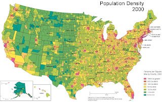
I would consider the second map to be a relatively good map because it contains all of the map elements described above, aside from an orientation indicator. This inclusion of such elements makes this map much more understandable and therefore, more useful to the viewer. Unlike the first map, this map includes a title which allows the viewer to have a first overall idea of what information the map is trying to convey. The inclusion of a legend is also highly significant, as it informs of the units used in the classification (persons per square mile by county) and what colors represent the highs and lows of classification so the viewer is able to orient itself, unlike in the other map. The inclusion of source information and not one, but three, well placed scale indicators also make this map more useful to the viewer. Although, this map lacks an orientation indicator, the map is fairly understandable due to its familiar subject area (the whole of the U.S.), which a decent amount of people would know is pointing north in this map. Also, the layout of this map is superior to the first map, with empty space being more minimal and more balanced by the inclusion of other map elements, and with the insets being less noticeable, and therefore in a more proper place in the visual hierarchy.
Census 2000 Maps


No comments:
Post a Comment